Mooneyes
Lunch Box

This project was a quick exploration in designing a children’s lunchbox, with the option to pursue either a hard-shell bento style or a more traditional tin construction.
I chose to develop a vintage-inspired tin lunchbox, drawing on both personal references and broader visual research.
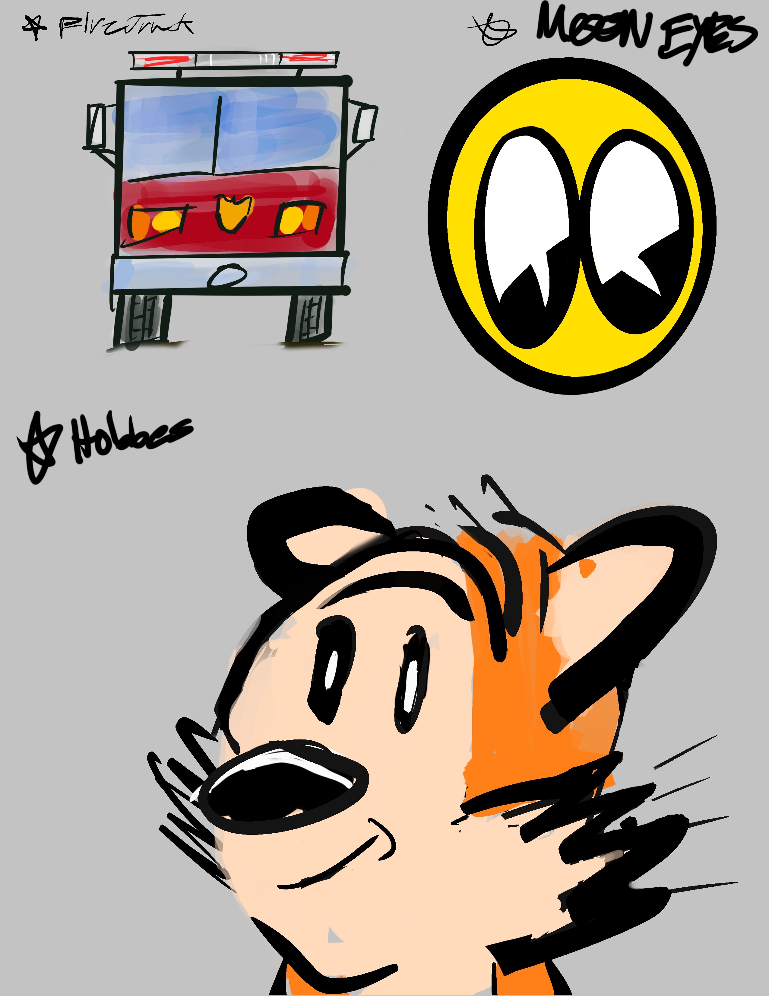
My initial concept was inspired by a fire truck lunchbox I carried as a child, which I associated with my dad going to work with his briefcase. While this direction had strong personal meaning, I ultimately moved away from it in search of a more distinctive visual identity. I briefly explored themes from Calvin and Hobbes, but found that it didn’t fully align with the form factor I wanted to pursue.
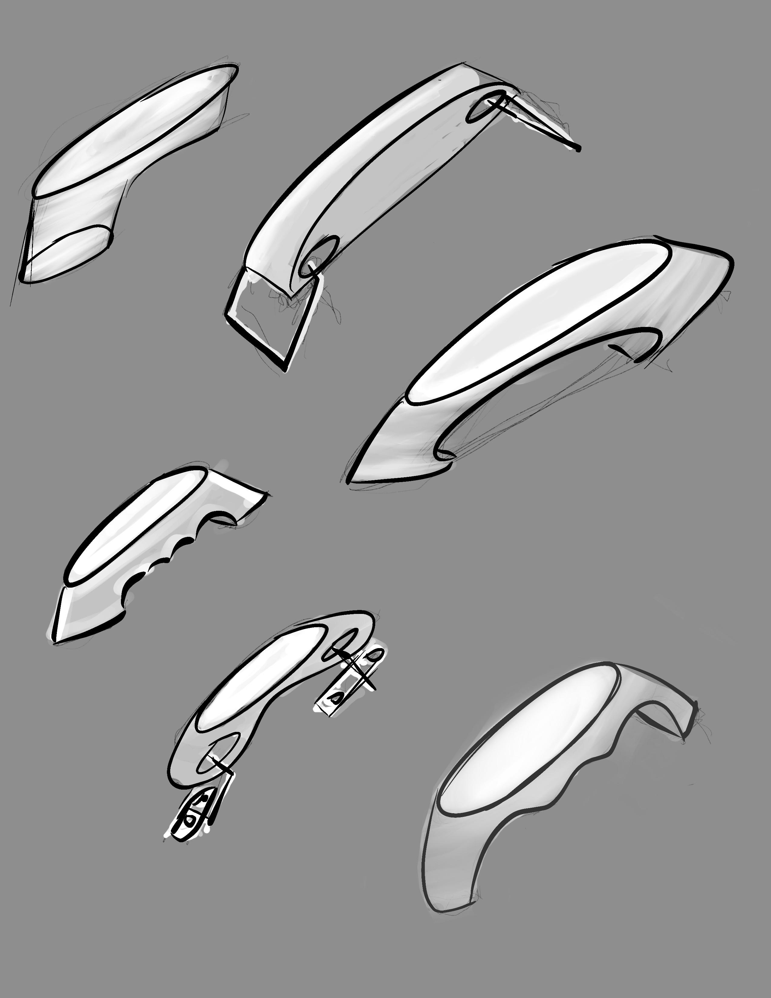
The final direction was inspired by the Moon Eyes logo, whose playful expression and roots in 1960s hot rod culture felt well suited to a classic tin lunchbox format. The design incorporates vintage details such as riveted handles and a metal latch, reinforcing the nostalgic quality of the object while giving it a bold, character-driven identity.